Microsoft has recently unveiled a new and overhauled Power Automate Flow Designer, which comes with a powerful feature called Copilot.
Copilot allows you to create and edit flows using natural language and provides you with guidance and suggestions along the way. After getting started using this blog, we recommend getting your hands on keyboards by taking the Power Automate PathFinder, which will get you up to speed with the new designer.
In this blog, we’ll explore how easy it is to use the new Flow Designer and Copilot, and what benefits they offer for novice and experienced makers alike.
How to get hands on
First up, lets deal with access to the new interface. Microsoft have made this quite easy so long as you are an explorer in nature and have the backing of your tenant admin.
You can follow this blog to find out how.
The new Power Automate Flow Designer interface comes tightly packaged with the new Copilot feature in Power Automate. So tightly packed in fact that at the time of writing, you will ONLY access the new designer experience if you begin or choose to edit your Flow via Power Automate Copilot.
As you can see below, from the Power Automate home screen (or via the new "Describe it to design it (preview) option present under the + Create menu) you can now access the new interface.
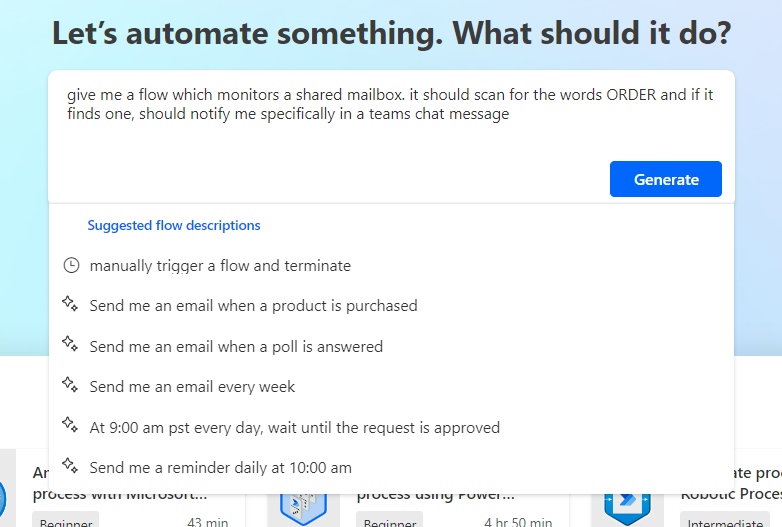
In the current incarnation, what you see above aligns to the selection of flow type and then the use of the wizard to select common Triggers for your flow. However, now we can 'Describe' the flow and it will move us through steps to create the basic actions we need. This is the next step that you will see.
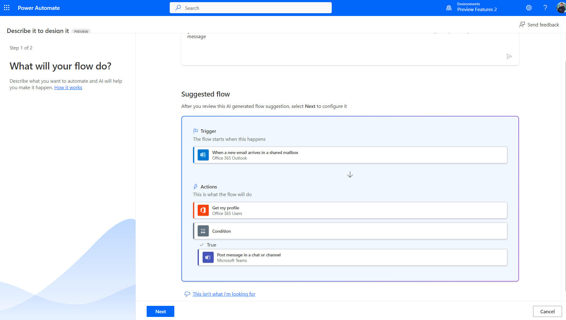
If you continue, you will arrive at the modernised Copilot interface (more on that in a moment).
Taking a step back, if you use the traditional + Create flow approach from make.powerautomate.com you'll receive the same look and feel at the end of the process that you have been used to for the last 2-3 years.
That said, however your flow has been created, you can choose to Edit With Copilot on any saved flow to interact using the new interface. The example below shows this via My Flows.
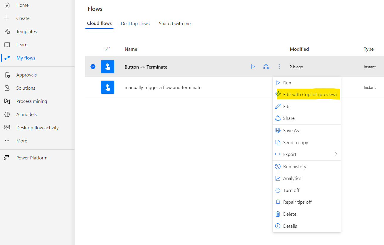
I'm sure this will change as the rollout continues but for now, it's an aspect I'm on the fence about as its offering up choices I'm personally not yet ready to make. Perhaps a toggle as we have in the new Teams interface may be more helpful for some.
Irrespective, lets dig into what the experience is like an what opportunities are offered up that we may not have had before.
What to expect from the Copilot enabled interface
Once you land in the new Power Automate Designer experience, the first thing you will be struck with is the more modern look and feel. It does feel now like you are entering a vast canvas of opportunities where you can craft and develop workflow improvements in an intuitive manner.
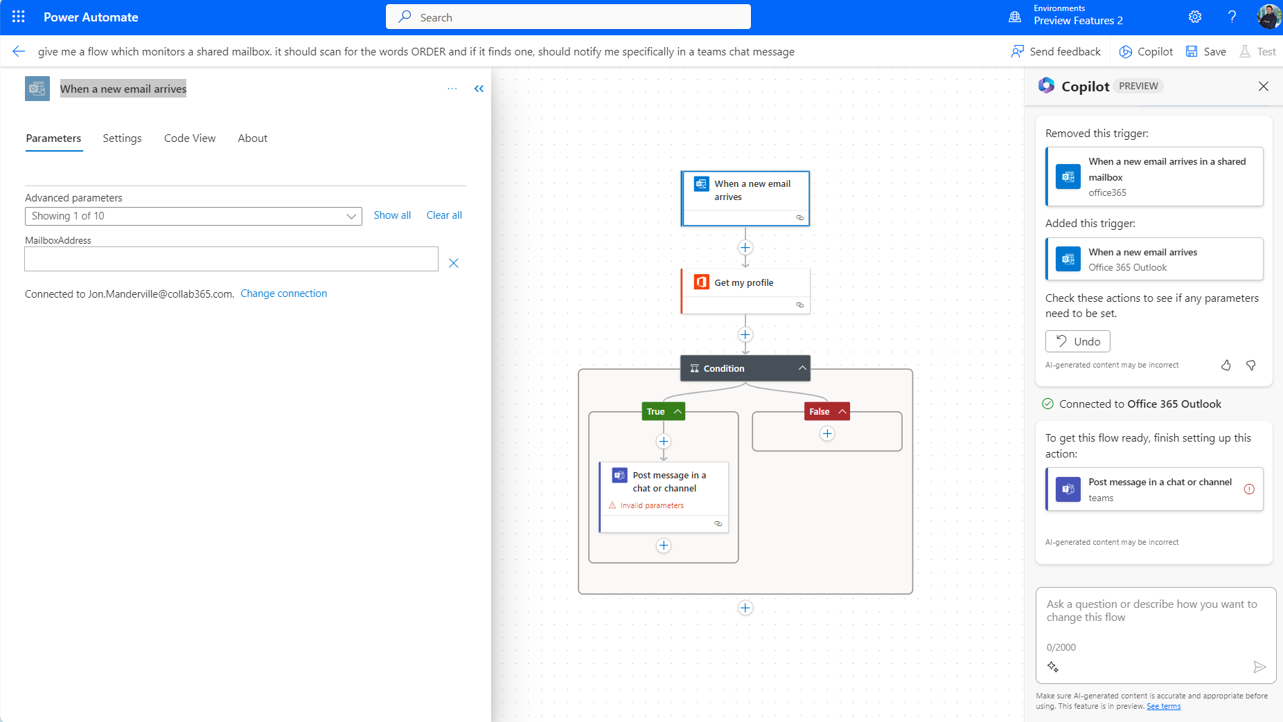
I say vast because immediately, you notice the canvas feels more 'fluid'. You have a huge dotted canvas (which encourages you to zoom and scroll when you realise how large it is).
Miro comes to mind when I look at the new interface. (for those who may not be aware, Miro is a planning and collaboration tool that many teams use - aligned to Microsoft 365's Whiteboard in purpose. Check out our blog here if you want to know more).
This comparison not only comes to mind because of the dotted large canvas layout (helping you understand where you are in terms of scale) but also the implementation of a Flow map where you can zoom in an focus on aspects of the flow if you go the route of complex multiple route and branch flows.
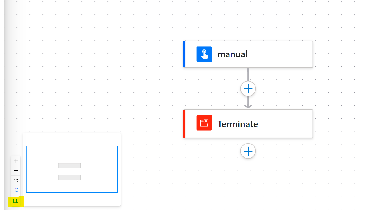
flow map
You also get the left hand pop out pane which is like the current Miro experience where you configure the actions in your flow in a little more detail.
The other first impression I took from the new designer is that you can now click onto your flow actions and move them around in a much more fluid way than previously. They feel like building blocks on a canvas rather than anchored as they were in the current interface.
Changes to look out for
There are many changes in this new interface. Let's look through these in an order that a maker or Citizen developer might encounter and consider...are these changes good, bad or do they leave me on the fence?
Creating Flows
I've already shared above an example of how you might create a new flow using natural language. The end result is largely the same as the traditional interface experience, however there are some new notable experiences which can definitely save you time.
The first of these is the immediate presence of Copilot. It is offering you the issues with your flow as it currently stands and asking you to correct them.
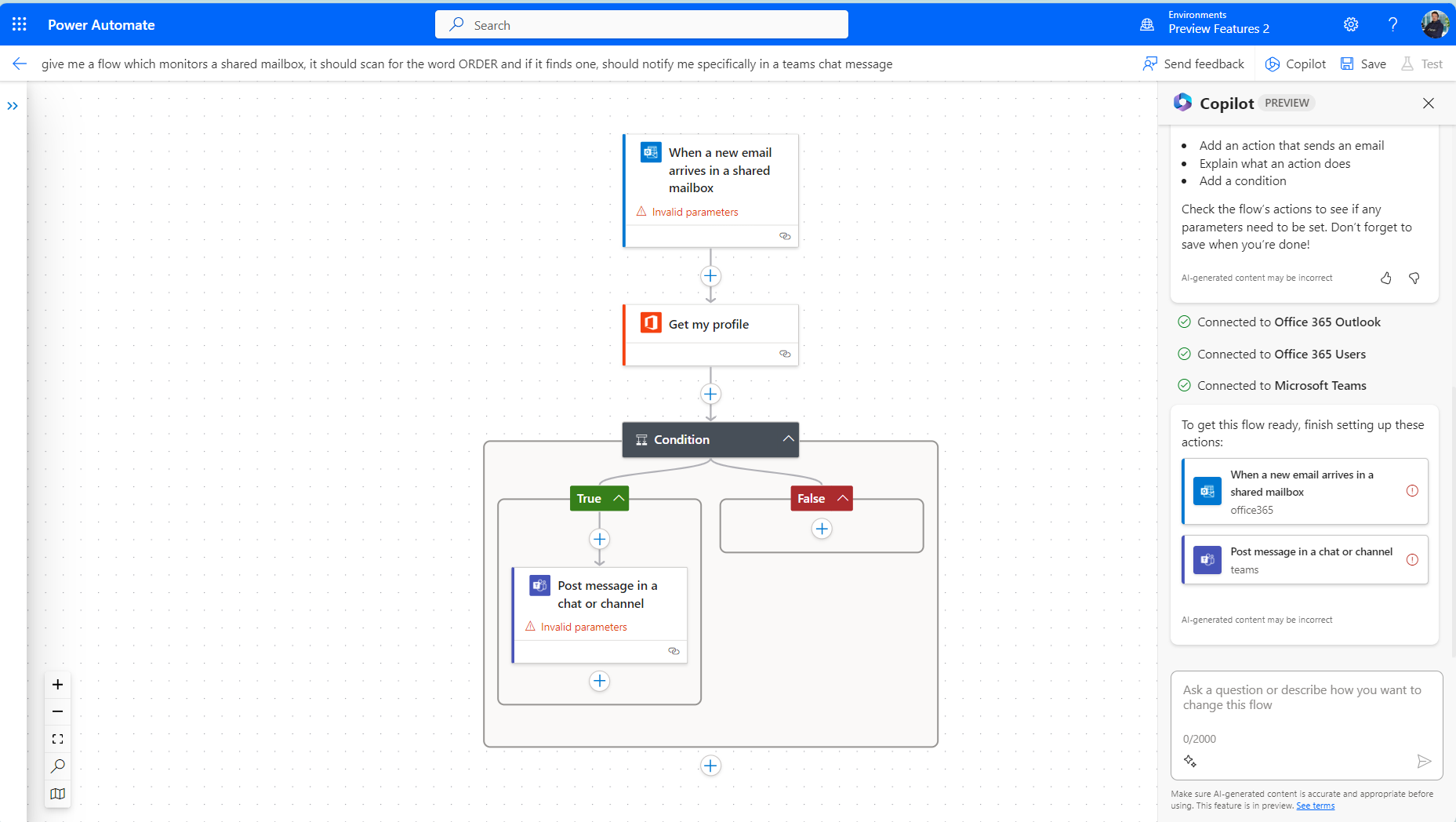
when you click on any of the actions it has highlighted, the context box on the left pops out inviting you to complete the information.
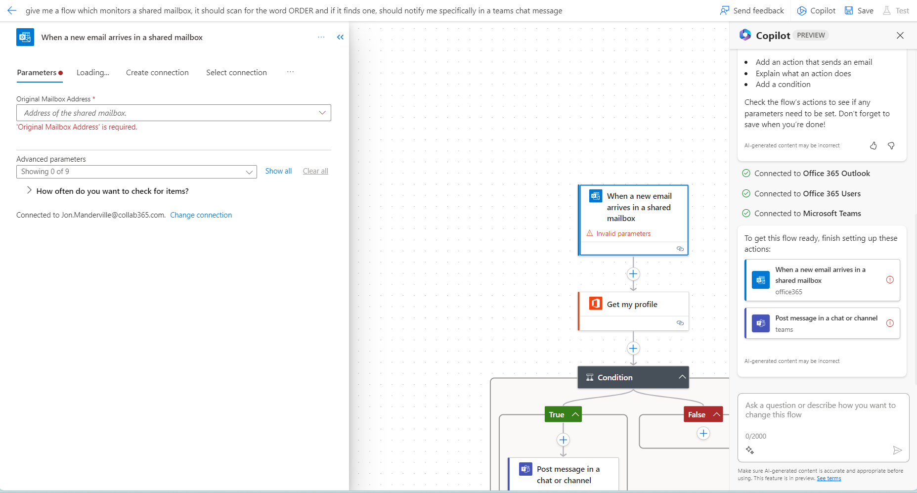
This guided approach I like. However the pop out box takes a little getting used to. So for this aspect, Im on the fence and will give an 'Unsure' rating.
Changing Triggers and Actions
With the example above in place, one opportunity I REALLY like is the ability to simply describe a change you want to make. In my case, the error made me realise I did not want to monitor a shared mailbox. Instead, I want to monitor my own. So here's what I did!
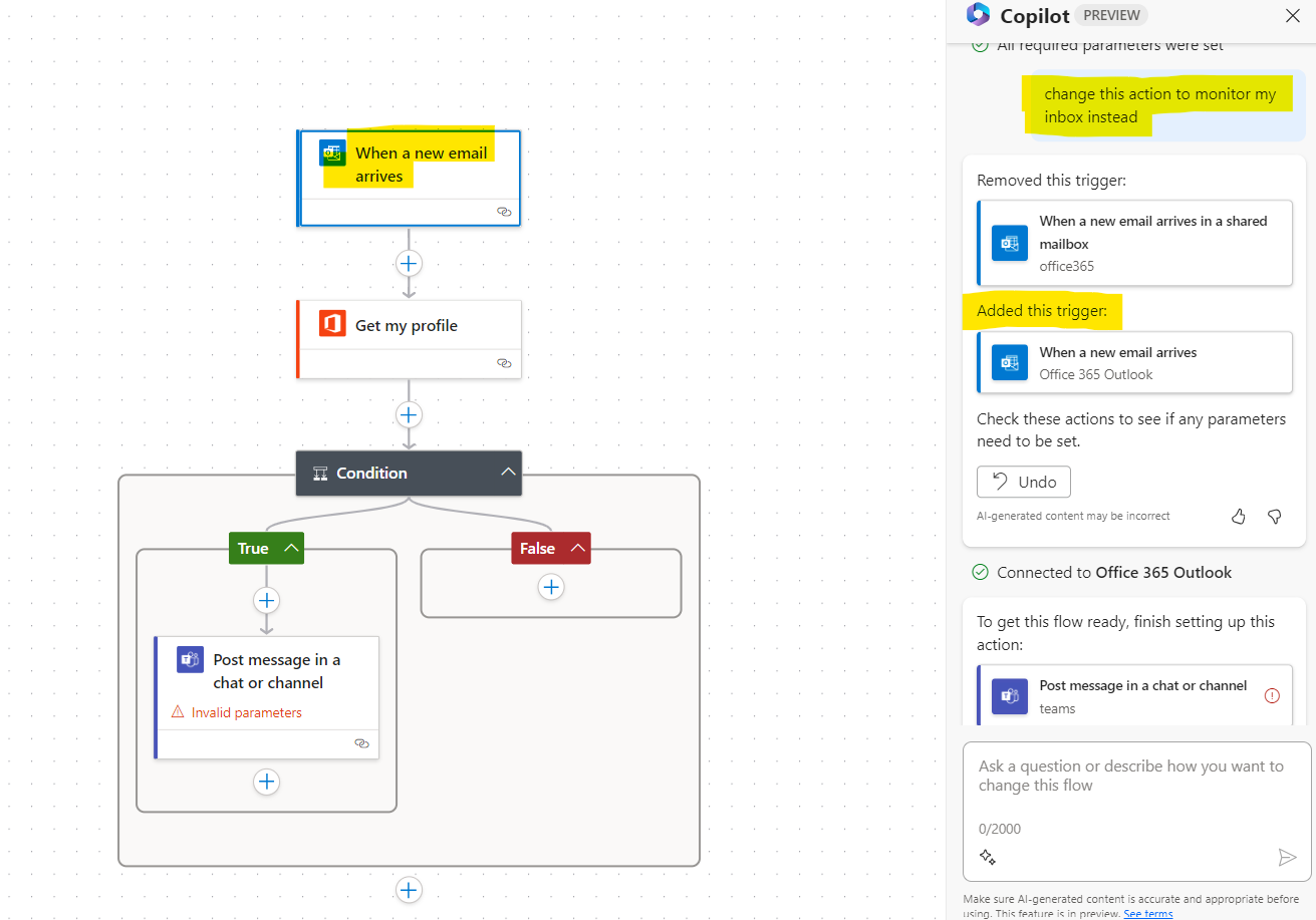
change
Now you could argue deleting the trigger manually would be as simple but the clicks, warning messages, new selection and search would all take a few precious seconds when the same effect happens in a fluid manner via a simple sentence. I love this aspect.
So for me, the ability of Copilot pick out actions and replace them (albeit on a very small sample use case) gets a GREAT rating!
Getting The Best From Templates
Templates have always been a shortcut to flows making but to date, I have always felt that as they are ready-made, there is a lot of implicit knowledge needed to get one to work for YOU.
The developer of the template has made decisions, bound actions to locations in a tenant and set things up as they see fit. So whilst templates are an inspiration for me, they have not yet moved into being truly portable solutions I can pick up and quickly use in the main.
I think that just changed with the advent of Copilot. What you have effectively done is create a template for yourself dynamically. The addition of Copilot telling you what needs to change AND your ability to describe changes you want to make leaves me feeling this could be very powerful indeed for the novice maker.
Take the example below. I'm given highly intuitive and directed instructions to complete the template. It's like having a template but with the maker alongside you. Click the action in Copilot and you'll be given the pop up to complete on the left side. In this case, I had to select who to post as and which channel to post into.
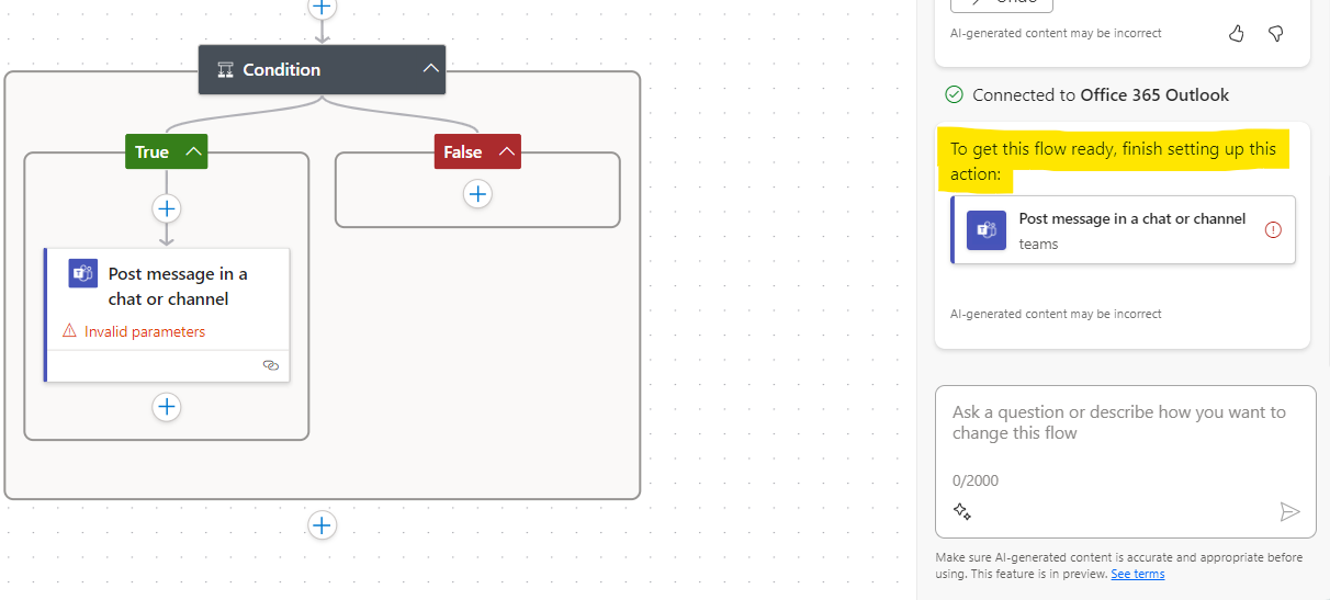
One other thing you can do is get more intuitive help on actions. In the past, you've had help via small links to web pages an some hint text but it's not left me feeling in the know about all of the actions I have been using. It feels like we are taking a step in the right direction however with the actions you can take via Copilot.
Choose an action you are a little unsure about and use the context menu to open up options. One of these will give you more information about that action. This may be no more than we had previously but the fact it feels more 'conversational' is something I like.
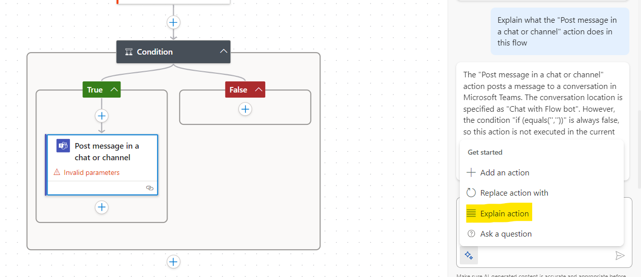
Because these tools seems to work pretty well to keep you in the flow of work and feeling like its YOUR work but supported by Copilot, I'm definitely giving a GOOD rating in terms of using what are effectively templates that you create.
Working With Actions
Templates are rarely the complete picture. You often add actions to your flow. You set new conditions and such.
This has been quite easy in the past. You simple click the Plus icon. Use words to represent the group of actions you want and then scroll the list.
Lets have a look at how that's changed with an example where I want to get the @ mention token for a user so I can post into teams and get their attention.
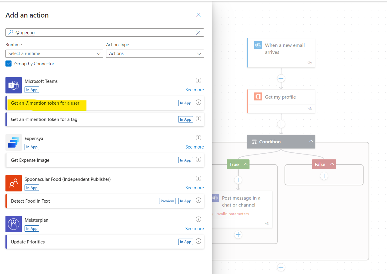
You can follow the traditional method of clicking plus. The interface has changed, you now see actions below their group header but in the main, it' no more easy or hard than it was before. Just different.
I experimented with adding actions via Copilot and have to say, whether it was a capacity problem on the service at the time or just my freshness with the approach, it was a frustrating experience
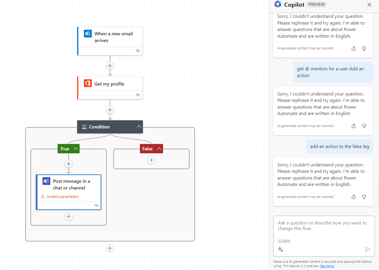
For the level of control I would like via Copilot, I feel there is the beginning of something very promising but as you would expect - it's in Preview. It's not quite there yet so my rating is NOT GREAT for this aspect.
Add Dynamic Content and Expressions
To wrap up this first look Blog, I wanted to experiment with adding a Compose action and performing some calculations via an Expression - to see how easy this would be.
I've gotten used to the existing interface, mixing an Expression with Dynamic content. Knowing that I have to click INSIDE the brackets before selecting Dynamic content for an expression. It all seemed to work fine. So what is the new interface like in this aspect?
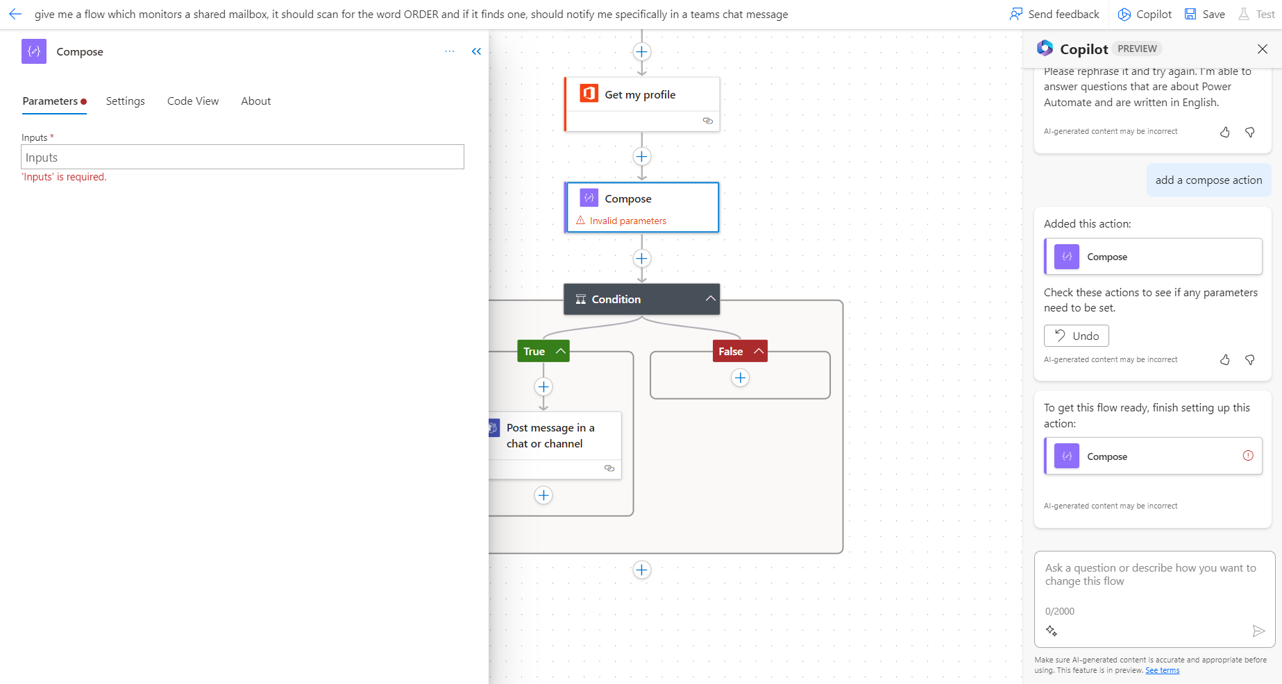
As you can see in the image, it was pretty easy to add the action. Yes it added to the bottom but a simple drag up in the flow and I placed it where I wanted without fuss.
Clicking into the action the left hand pane still offers me the chance to use Expressions and Dynamic Content. Albeit, you need to click into a box to see those options. (I could not screenshot this for you but have a try and see how you get on).
The process of adding an expression has changed a little but it's still as intuitive as it was before.
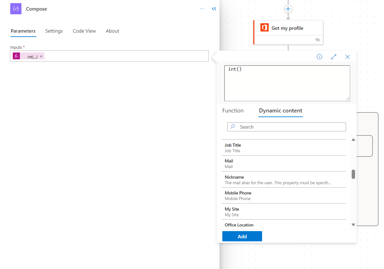
In respect of using Dynamic Content and Expressions, although you are looking in a slightly different location, I suspect this will become easier the more you use it and soon feel like the norm. It's an UNDECIDED rating on this aspect.
What Is Flow Admin Like?
A few best practices to call out here.
- Rename your Flows early - With flows being created via potentially lengthy Copilot descriptions, I noticed my flows were no longer called "Untitled" but instead had war and peace names. One to be aware of and to get used to changing early.
- Give actions meaningful names - renaming is easy in the new interface. Open the left pane for an action and type! You can also easily add notes and comments
- Moving Actions - With the new interface, the whole UI has a more fluid and friendly feel. Moving actions is simple clean. Just click and move
- Copying Actions - I may have missed this but as it had started to misfire a lot in the old interface, the absence of a copy to clipboard really doesn't concern too much
- Copying Actions - Copying to Clipboard had been a little hit and miss for me in the old interface. The absence of a "copy to clipboard" option in the ellipse fr each action in the new therefore really didn't concern too much. HOWEVER I did use Copilot to perform this action and have to say, Im impressed.
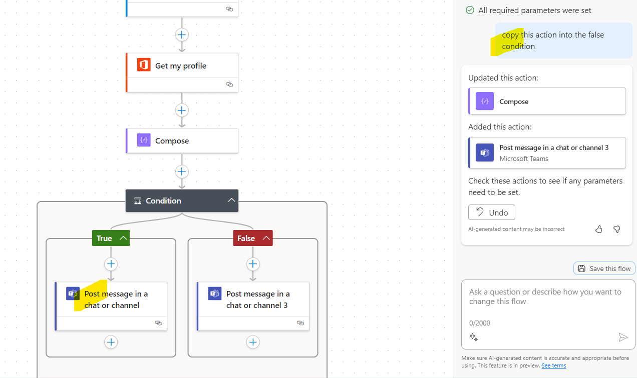
copy
What New Options Are There?
As we explore and discover new opportunities the Copilot interface opens up (hopefully in the space of helping with expressions and such), we will add Blog posts and update this one.
For now, I have to say if I were a novice maker and wanted a leg up to get started, Copilot is Great. Even when digging a little deeper I think there are great opportunities to utilise what's on offer. The adoption curve may take a little time for us however but as we learn to do more with this interface, I'm sure the shift could become a permanent one.
Check in with us at the Academy in a couple of months to see how we feel then!
