If you are looking for a way to create reusable blocks of functionality in Power Apps, you might want to learn about components and component libraries. In this blog post, we will explain what they are, how they differ and how they can benefit your app development.
What Is A Power Apps Component?
Components can be as simple or as complex as you intend for their use case. They can be pieces of logic that perform calculations or execute actions inside an app or across apps. They can also be a set of controls with defined behaviours and properties such as navigation menus, headers and buttons.
Components can also have input and output properties that allows for the passing of information between an app and a component. What does this mean? We can build our components in a dynamic way that can serve a similar purpose across different applications.
What Is A Local Power Apps Component?
A local Power Apps component is a feature you'll potentially be familiar with. When we talk about local components we are referring to components that are directly built with in the apps that they are intended to be used with. You'll find access to the components tab to begin creating local components from within your Power Apps Studio with any Power App opened.
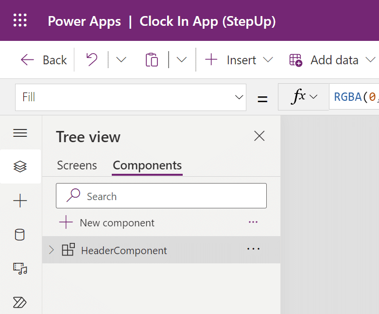
We can design components just like apps. You can drag and drop any array of controls from the insert pane on to the component canvas.
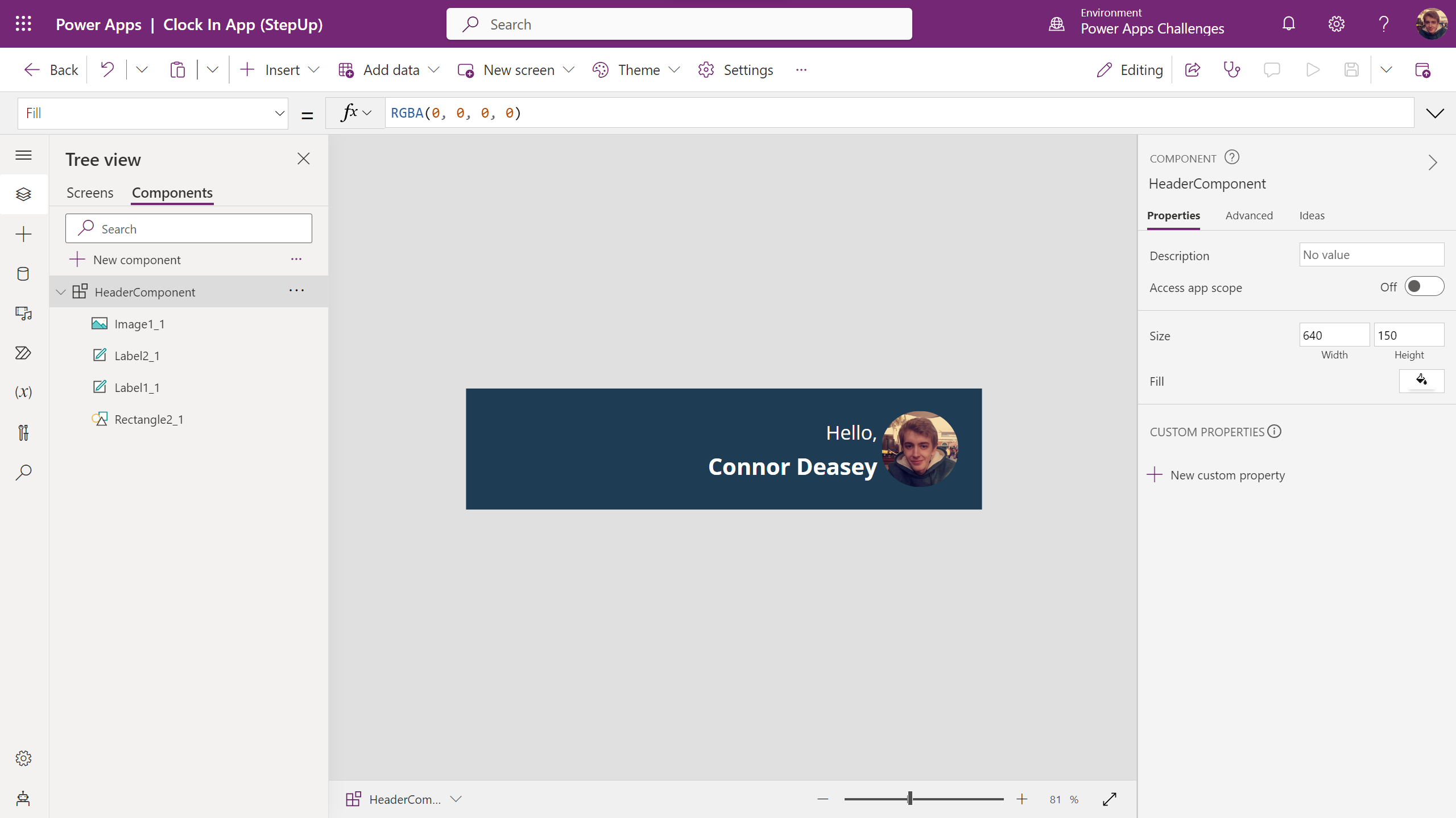
Remember: By default, any components you decide to build here are only exposed to the app they are created in. There are ways to export local components across apps, environments and tenants but we'll look at that in another article.
What Is A Power Apps Component Library?
A component library is where Power Apps development can get a little more interesting and you'll quickly learn how developing these skills can enhance and speed up your development.
Components in component libraries work similarly to the way a local component would, however they are stored and accessed in a slightly different way.
First a component library needs to be created. This can be done from the Apps tab in the Power Apps Dashboard.
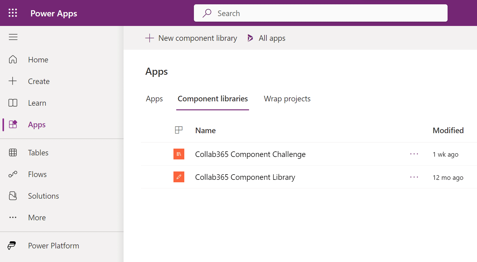
On creating your first Component Library, you'll quickly find that the interface is very familiar. However, we are directed straight to the component tab in Power Apps Studio.
Important: Whilst the screens tab remains visible in the Power Apps studio for a component library build, it does not correlate directly with any app and also does not create one. The screens section is predominantly for testing purposes when building your components within the library.
Just as before, we can build components as you would normally by dragging controls onto the component canvas.
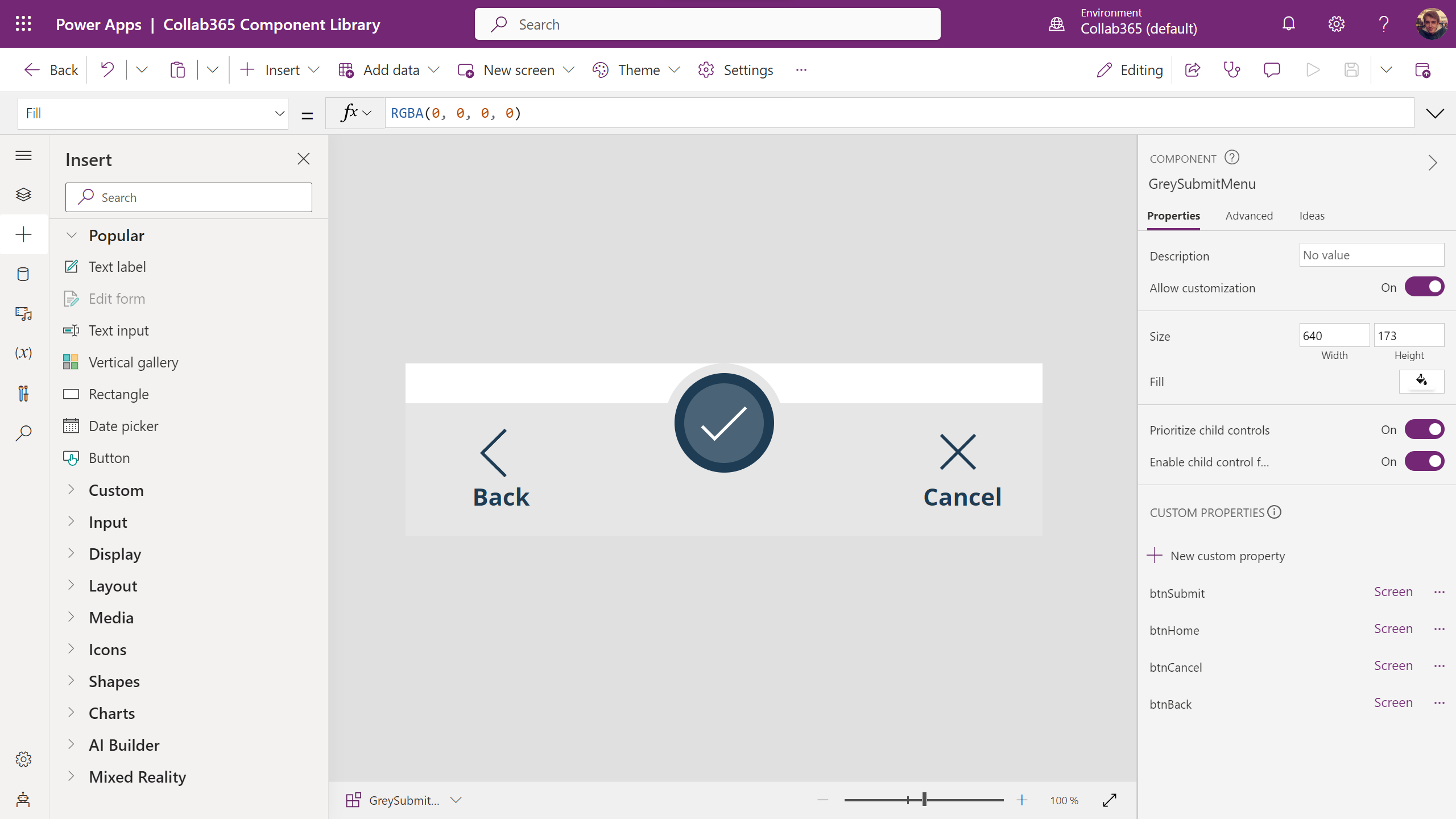
The biggest difference between Component Libraries and Local Components is that Libraries are exposed to the Power Apps Environment where they are built. Meaning you can build components to be reused and applied to any new or existing apps where your component would need to be used in that Power Apps Environment.
App Designer vs Component Designer
Now we understand components a little more, it's worth pointing out a few key concepts of Power Apps development that could shape the way you approach component building. For this explanation, let's take a look at two types of developer...
App Designer
I don't want to use complex formulas! I'd rather use drag and drop controls and configure pre-defined properties that are set out for me so I can get my app published quickly.
Component Designer
I'm comfortable with Power Apps formulas and understanding development concepts that can help me build dynamic components for App Designers to use.
An App Designer could be someone who knows the basics of Power Apps. Maybe they can drag a few controls on to the screen and configure them, but let's say for example they needed to build a complex navigation control to help users find their way around their app.
As a Component Designer, you can think around this problem in a slightly different way. You've been tasked with building that complex navigation control as a component that can not only be used in the App Designers app, but across multiple applications inside an environment.
Utilizing the feature set that comes with components, you are able to think about more than just laying out a set of predefined buttons and icons for a navigation bar, and think more about "What control can I give the App Designer when using my component". For example, a component could be built using those input and output properties we mentioned earlier to give the app designer the option to set their own icons, text and colors for the component.
Important: We've explained a hypothetical scenario and you'll often find yourself taking on both roles, but it's important to understand these concepts as they will help you implement the best practices and develop your design processes when building components.
Getting Started With Components In 6 Steps
Step 1 - Create A Component Library
To begin, we first need a component library to work with. Open the Power Apps Dashboard and select the Apps tab on the left hand side. Then using the horizontal navigation, select Component Libraries.
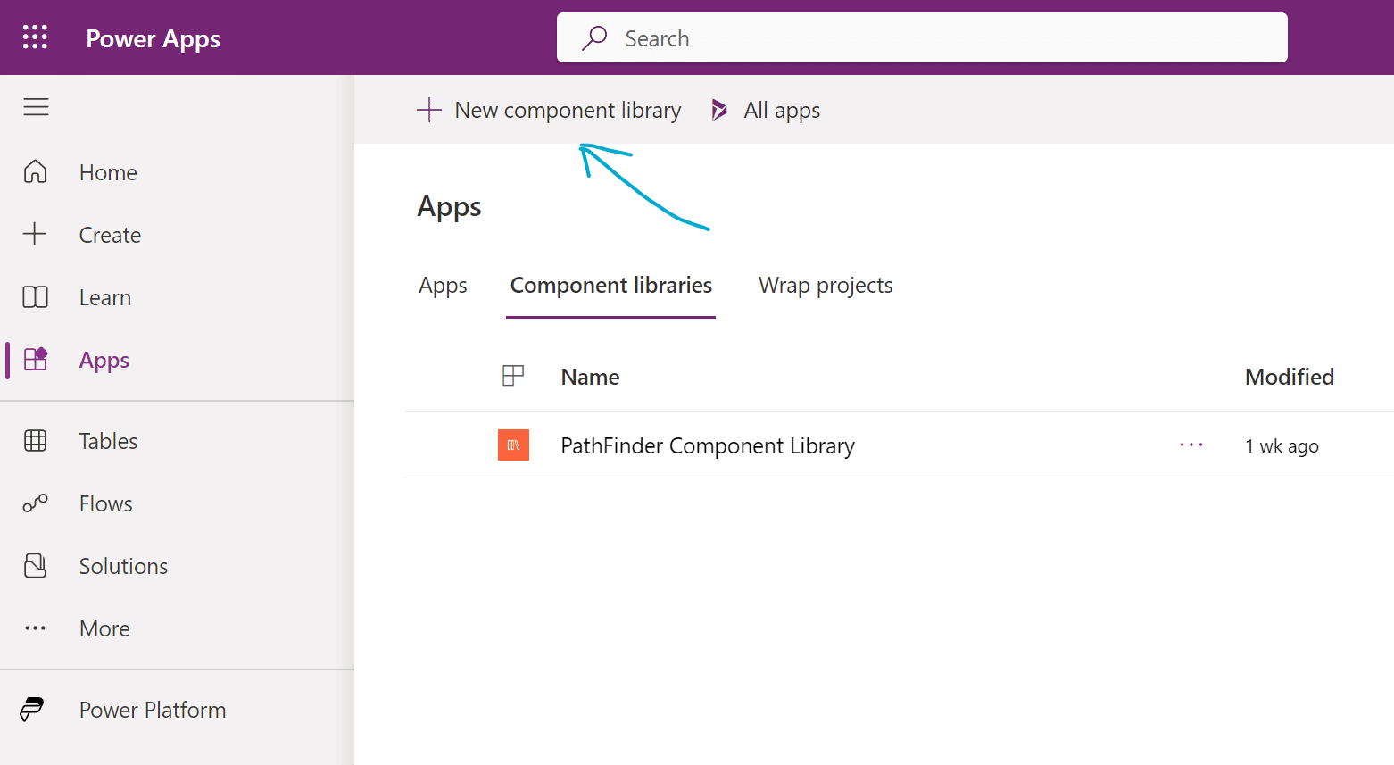
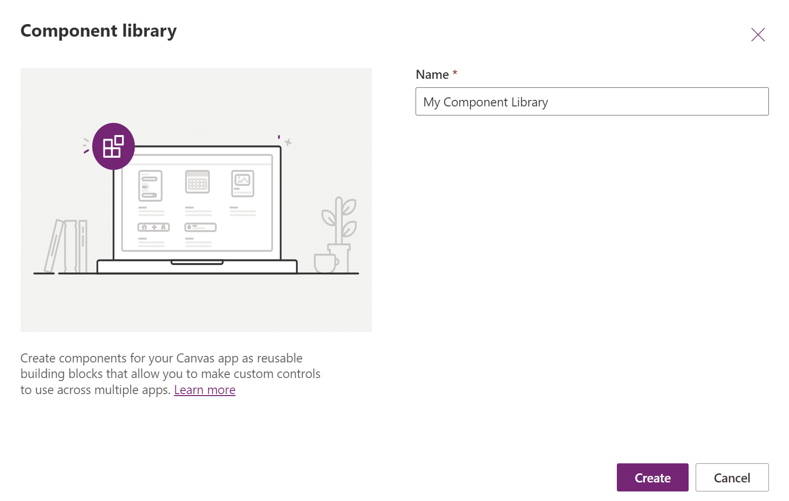
Then select New Component Library, name it My Component Library and click create.
Step 2 - Add Controls To Your Component
Let's build a simple header with some input controls. Reshape the size of the component canvas to be Width 640 and Height 100 using the properties pane on the right.

Add a Rectangle to the component and set its dimensions to the same as the component itself. You can do this by dragging the handles surrounding the rectangle or by setting the dimensions using the properties pane.

Add a Text Label for your header. I'll change the text to show MyTitle, then using the text properties, change the weight to be Bold, and justification to be center aligned. Finally ill change the font colour to be white.

Step 3 - Setting Up Input Or Output Properties
Let's set up custom properties to allow app designers to quickly change the color of the rectangle without needing to edit the component directly.
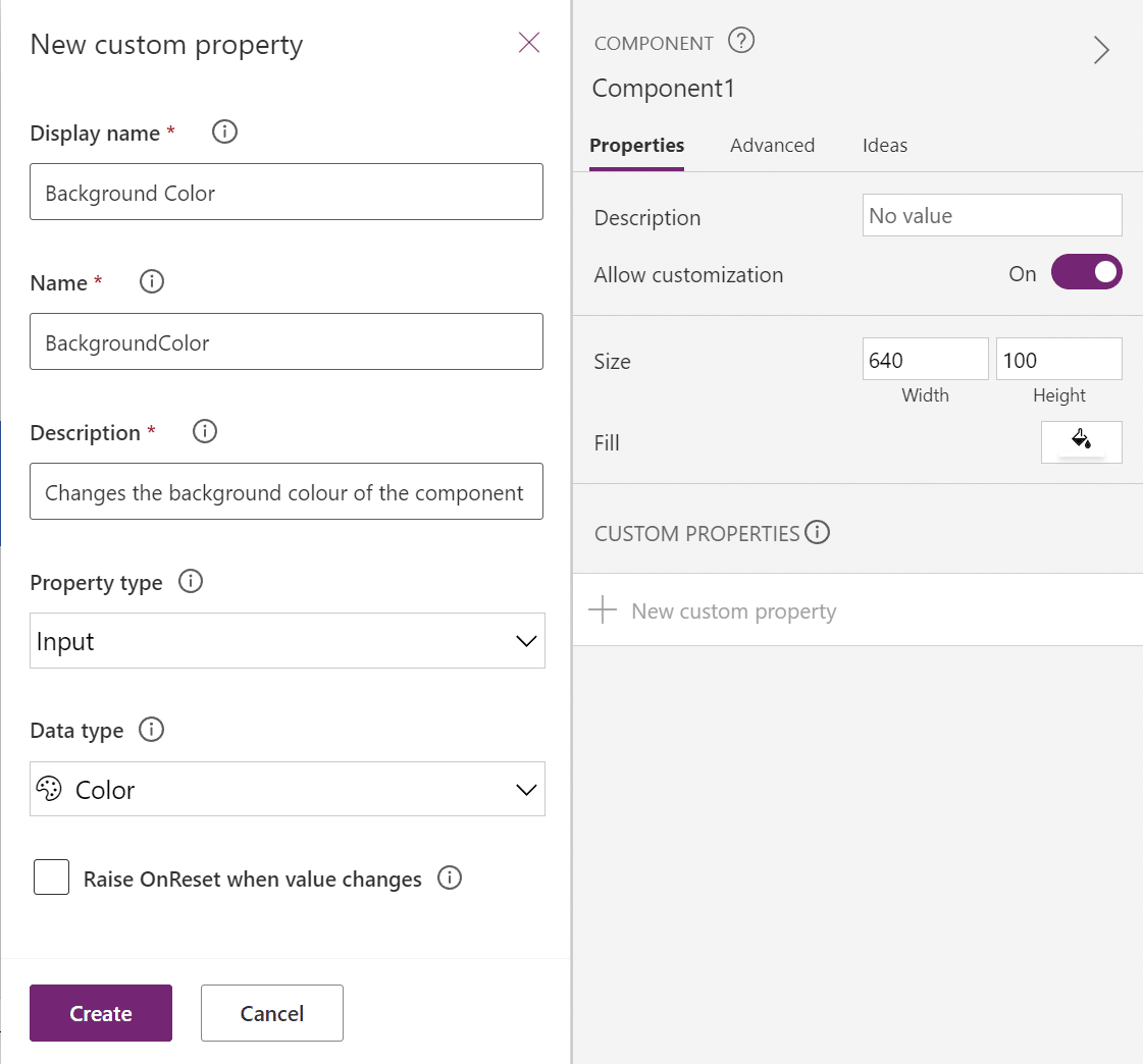
With Component1 selected, click New custom property. Then give your property a name, description, property type and data type. To allow this property to receive a value from the app that it is used, we must use the Input property type. As we are looking to change the color of the rectangle we can select Color as the data type.
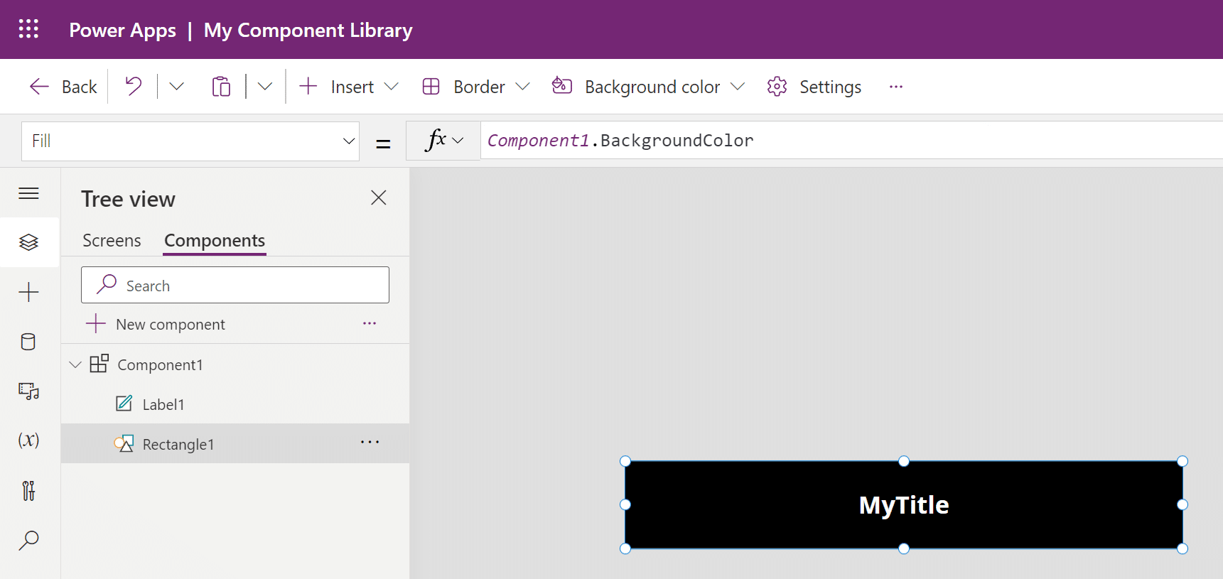
Now, set the Fill property of the Rectangle to be Component1.BackgroundColor. The color will likely change to black by default as it is expecting to receive a value from the app. This is normal behaviour. Using this formula now tells the rectangle fill to use the new property we created.
using custom property
Step 4 - Save And Publish Your Component
To expose our component to our environment where it can use the new component we just created, we must save and publish. It's important to publish every time you finalize changes to your component library or the apps where they are used will not have access to the latest updates.
Click the Save and Publish icons in the top right corner of Power Apps Studio.

Step 5- Add Your Component To An App
We can now bring our component into our apps. In the same environment where your component is saved, open an existing app or create a new app.
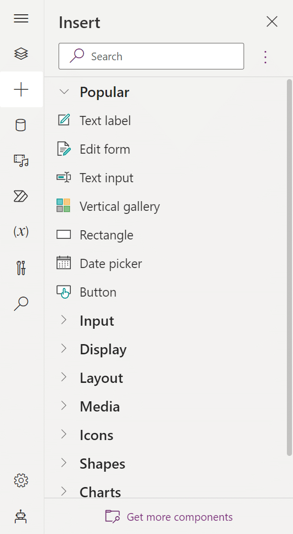
Then, underneath the Insert pane, select Get more components.
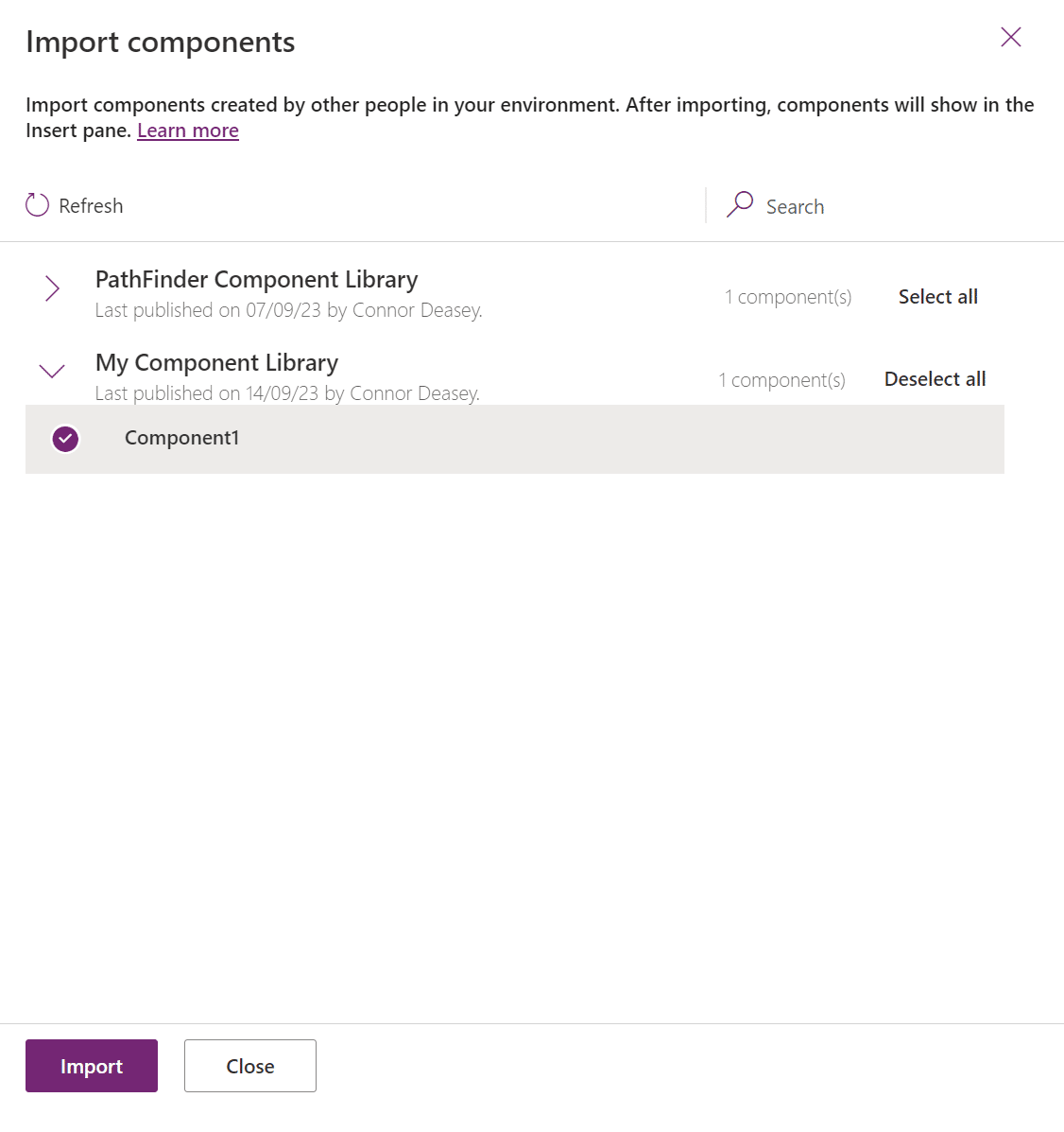
From the list, find My Component Library and select Component1 from the list and select Import to add it to your app.
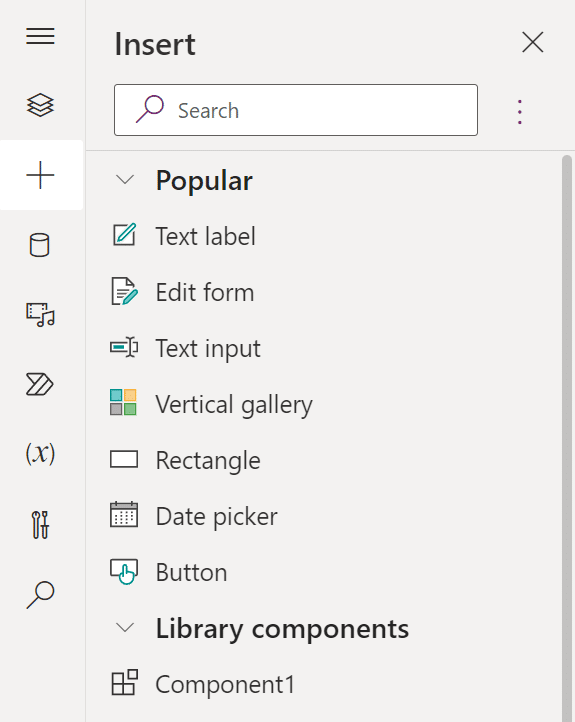
From the Insert pane, find the Library Components category and drag and drop your Component1 on to your canvas.
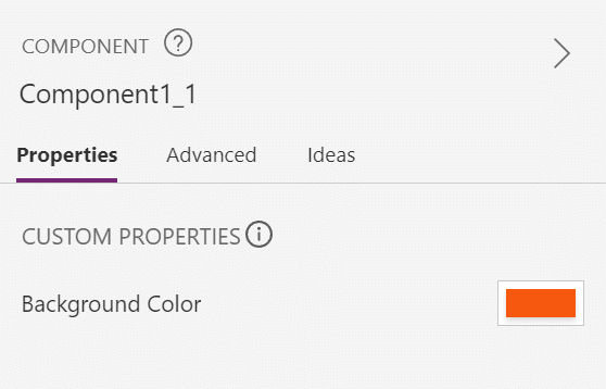
App designers can now edit the properties that you have exposed directly from within their app by selecting the component and viewing the properties pane.
Save and Publish your app as we will return to this later.
Step 6 - Update And Push Your Changes
Let's make an update to the component. I've gone back to My Component Library and changed the text label to be Home, then Saved and Published the component library.
On returning to the app where the component is used it now tells us there is an update that we can review.
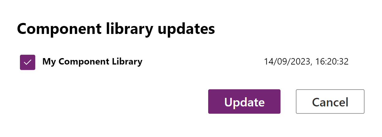
After selecting Review and Update you should now see the changes made to the component replicate to the component being used in the app.
Important: Whenever you publish changes to a component, you must revisit any apps where the component is used to review and update the component. There is no way to currently push changes globally to all apps.
What To Do Next?
If you are interested in learning more about Power Apps, I'd like to invite you to Join the Academy and take on the Power Apps Success Path! You'll learn how to build a real-world application from the ground up by building data tables that your app can interact with alongside making use of controls and the powerful features that sit as part of the Power Apps tools.

